|
|
||||||||||||
|
|
|
||||||||||||

|

| ||||||||||||
|
|
||||||||||||
|
|
|
||||||||||||
|
| ||||||||||||
In order to complete this tutorial
successfully, you should have basic knowledge of how to create motion tweens,
use alpha tweening, and how to scale objects.
Note: This also requires a little bit of creativity, or what I like to
call, "Skillz"
The Example above is running at 32 FPS. I use higher frame rates so that actions look smoother, although may not perform as well on older machines.
Step 1: Create a text box and type
whatever you want into it. Name the layer that this is on
"text". Also create another layer named "background" and
make it whatever color you want (works better with darker colors). Put this
layer at the bottom to ensure that it does not cover up any of your content.
Tip: As you get more experienced with this tutorial and/or have used it
multiple times, you will realize that longer texts or words look more sleek then
short words.
Step 2: Convert this text box into a Graphic Symbol(by pressing F8). and name it whatever you want
Step 3: Now create a motion tween with this text, lasting approximately 20 frames (depends on what frame rate you use; mine lasts 22 frames).
Step 4: On the last frame of this motion
tween, select the text and scale down as small as you can get it
vertically. Now center it as well as you can. If you play your
movie. your text should appear to shrink, or "lean back".
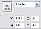
Tip: Use a more precise height by typing in a number (pixels). I
would set the height between 1.2px - 2.3px. These seem like small differences,
but they can make the difference between a horrible transition and a smooth
one. See picture below.
Step 5: Now create another layer and name it "line". Now place a keyframe around Frame 15 or so... I put mine 6 frames before the end, and draw a line that is the same length as your text. Try and center it directly over the middle of your text. Use a line thickness of no more than 1.5 pt
Step 6: On this frame (in step 5) will be
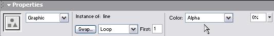
the line, in which your text will turn into. Now convert the line into a
Graphic Symbol just as you did for the text box, and name it
"line". Now create a motion tween lasting about 10 frames.
Note: The last frame of the motion tween on the first layer should be
about in the middle of your line motion tween.
Step 7: Now on the first frame on your "line" tween, change the Alpha setting to 0%. Then go to the last frame and put the Alpha setting to 100%. This allows for a much smoother-looking transition instead of the line just appearing.
Step 8: Now, put in about a 10-15 frame still moment (when nothing moves), and then another keyframe
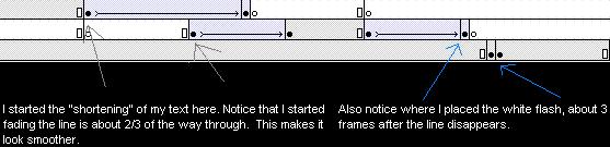
Step 9: Almost done... Now on your "background" layer, make a frame 2 or 3 frames after the end of the "line" tween. Make it white for one frame by creating two frames in a row and creating the second one black. The rest of the movie will be black, while one frame flashes white.
This tutorial is not perfect every time,
and may require some adjustments on your part. Make whatever changes
necessary to make it look better or run smoother. Certain fonts are hard to use,
and if you have a large space between words, it may look a little funny no
matter how much tweaking you do.
"Building The Web Into a Nicer Place -- One Site At A Time"
Developing Webs Group Copyright © 2001-2026 All Rights Reserved
Privacy
and Legal


